Elements of Composition
Fill the Frame
Good Fill the Frame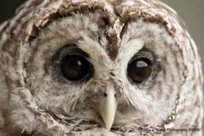
This is a good example of fill the frame because the owl fills the entire frame of the picture and takes up the space effectively and the owl is as close as can be.
http://4.bp.blogspot.com/ |
Bad Fill the Frame
This is not a good example of fill the frame because the bird is not taking up much of the actual picture and could be closer in. It is only at the top. Most of the space is just a soft blue color, but the subject is not filling the frame.
http://www.onthewingphotography.com/wings/ |
Visual Center of Interest
Good Visual Center of Interest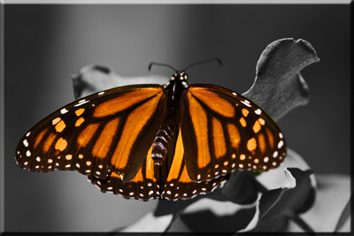
This picture of the butterfly is a good example of visual center of interest because the butterfly is clearly the center subject of the photo. Nothing is adhering to its position as the main and center theme of the photo.
http://ronbigelow.com/ |
Bad Visual Center of Interest
This is not a good example of visual center of interest because nothing is clearly standing out. There is no subject defined in the picture. All of the flowers are defined almost equally, leaving no indication of what to see first or what single thing the photo is focused on.
http://farm4.static.flickr.com/ |
Proper Subject Placement
Good Rule of Thirds
This is a good example of the rule of thirds because the puppy is running on only one third of the picture. The defined, main subject is put in a third instead of in the center, making for a good rule of thirds picture.
http://2.bp.blogspot.com/ |
Bad Rule of Thirds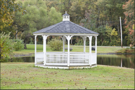
This is a bad example of the rule of thirds because the gazebo does not use any of the imaginary third lines to be positioned. It is simply in the middle of the picture and straight with no use of thirds.
http://www.better-digital-photo-tips.com/ |
Good Leading the Subject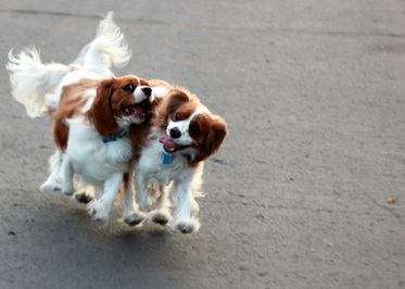
This picture uses good "leading the subject" because the picture gives space in the direction of the subject's movement. The dogs are running and because the picture has a lot of space, it leads the dogs to run into the rest of the picture, making for good leading the subject.
http://markyatia.com/ |
Bad Leading the Subject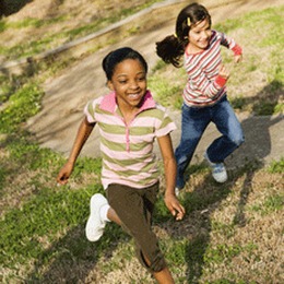
This picture does not use "leading the subject" effectively because there isn't enough empty space in the photo and there is no "lead room." There is no leading of the subject. If there were more room, the girls would appear to be running through the picture. There needs to be a sufficient amount of space in the direction that they're going. The girls are practically out of the picture already, making for not much leading the subject.
http://www.healthypeople.gov/ |
Using Lines
Lines to Center of Interest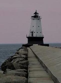
This picture uses lines to draw the viewer to the center of interest, which is the lighthouse. The sidewalk and its sides provide lines that lead directly to the lighthouse in the background and cause the eyes to follow to the subject.
www.freephotoed.com |
Horizontal Lines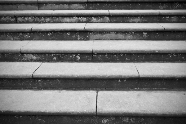
This picture uses horizontal lines effectively because they are strategically placed to make it a simple image with a unique style to it. It uses horizontal lines to make the picture look professional and nice, even though it is just stairs.
http://www.willowhousephotography.co.uk |
Vertical Lines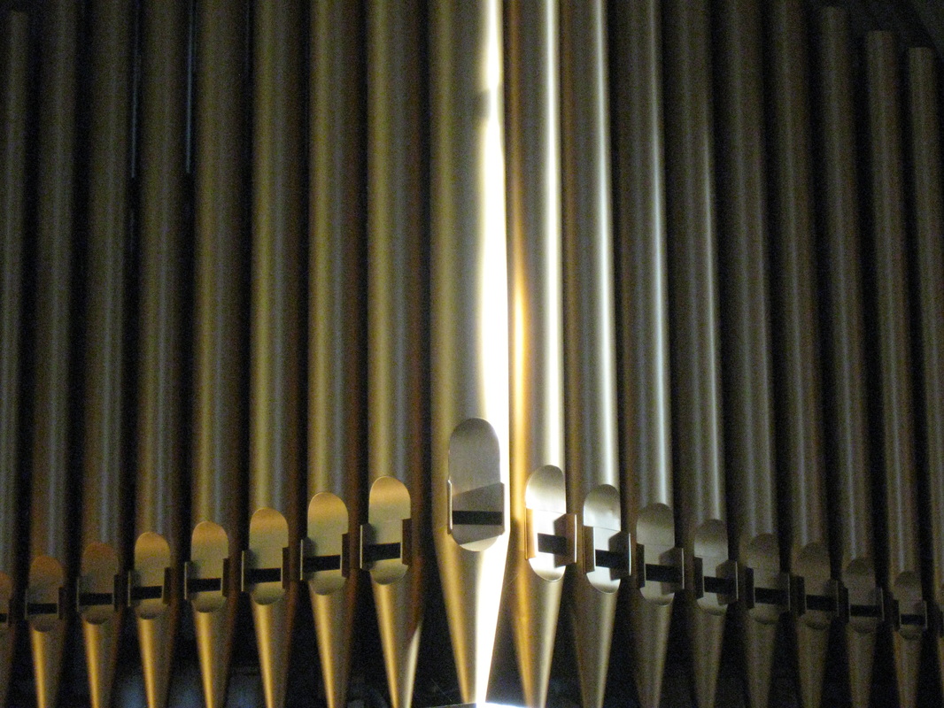
This picture uses vertical lines effectively because it defines each single pen-like object and uses the vertical lines to give the picture depth and definition. It helps to make the pen-like objects to pop out and makes it a better picture.
http://www.robsocalearningblog505176.com/ |
Curved Lines
This picture uses curved lines effectively because it helps to show how the planes are moving and it gives the picture a sense of being "alive." The curved lines causes the picture to look as if it is turning and gives the picture an interesting look.
http://farm4.static.flickr.com/ |
S-Lines

This picture uses s-lines effectively because it shows the flow of the river through the grassy plains. The s-lines give the picture a proper scenery of the area. It helps to describe the landscape of the area and makes the picture look calm.
http://www.photographyicon.com/
http://www.photographyicon.com/
Frame Central Subject Matter
Good Subject Framing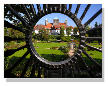
This picture uses good central subject matter framing because the small circular hole frames the building and its yard. It brings out what the subject and its surroundings are supposed to be and helps to make the eyes look at what they are supposed to be.
http://visualphotoguide.com/ |
Bad Subject Framing
This picture could use a frame. With a frame, it would bring out a specific area in the mountains and make the picture seem more focused. The central subject matter is not framed so it can't be seen. A frame is needed so that the viewer can tell what the central subject matter is so they eyes will be brought to that area.
http://cdn.cambridgeincolour.com/ |
Visual Perspective
Good Use of Visual Perspective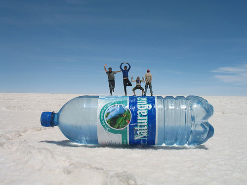
This picture uses visual perspective effectively because the perspective makes this picture seem as if the four people are standing on top of the water bottle. Because of the position of everything in the camera and the perspective of how it looks, the water bottle looks gigantic and the people look miniature.
http://smashingspy.com/ |
Bad Use of Visual Perspective
This picture does not use visual perspective well because in this picture, the perspective is not affecting anything. The picture looks normal and the perspective does not add or take away to the picture in any way, making this a bad example of using visual perspective in photos.
http://www.hyle.org/ |
Repetition of Shapes
Good Repetition
This picture uses repetition effectively because it helps to give the flower different layers. It helps to have a deeper look into the flower and helps to define the flower completely using its repetitive shapes.
http://plantwhateverbringsyoujoy.com/ |
Break in Repetition
This pictures uses a break in repetition effectively because the repetition is horizontally placed white eggs. Because the turquoise egg is breaking the pattern, it becomes the subject of the picture, thus making the break effective. By breaking the pattern, the turquoise egg stands out and the eyes are immediately focused on it.
http://4.bp.blogspot.com/ |
Avoid Mergers
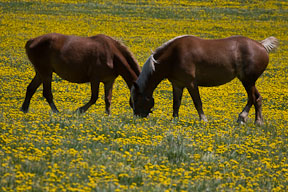
This is a bad example of avoiding mergers because it looks like the horses have one head but two opposite bodies. Their heads are merged together and its makes the picture look distorted and unprofessional.
http://www.ultimate-photo-tips.com/
http://www.ultimate-photo-tips.com/
